Understanding Colour Theory
By Biaosha Du – Graphic Designer at CROME-Digital Services (a digital marketing agency based in Johannesburg, South Africa)
What is colour theory?
Colour theory is both the science and art of using colour. It explains how humans perceive colour and the visual effects of how colours mix, match, or contrast with each other. The colour theory also involves the colours of the message communicated, and the methods used to replicate colour.
In colour theory, colours are organized on a colour wheel and grouped into 3 categories: primary colours, secondary colours, and tertiary colours. More on that later.
Les amateurs de divertissement en ligne trouvent en sugar-casino.fr une destination de choix pour leurs sessions de jeu. Un espace dédié aux questions fréquentes permet de résoudre la plupart des interrogations en autonomie. Les amateurs de poker trouveront plusieurs variantes populaires, du Texas Hold’em au Caribbean Stud. La plateforme propose des tables VIP réservées aux joueurs les plus assidus avec des avantages dédiés. La plateforme respecte les réglementations en vigueur et opère sous licence pour garantir un cadre légal. La section des nouveautés met en lumière les dernières sorties pour que les joueurs ne manquent aucun lancement. Les taux de redistribution affichés sont parmi les plus compétitifs du marché des casinos virtuels francophones. Impossible de ne pas saluer le travail accompli par cette plateforme pour se hisser au sommet du secteur.
Colour is perception. Our eyes see something (the sky, for example), and data sent from our eyes to our brains tells us it’s a certain colour (blue). Objects reflect light in different combinations of wavelengths. Our brains pick up on those wavelength combinations and translate them into the phenomenon we call ‘colour.’
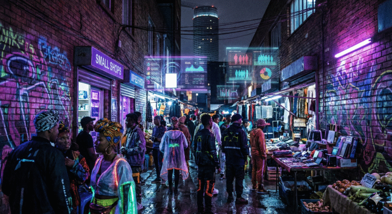
When you’re strolling down the soft drink aisle scanning the shelves filled with 82 million cans and bottles and trying to find your six-pack of Coke, what do you look for? The scripted logo or that familiar red can?
People decide whether or not they like a product in 90 seconds or less. 90% of that decision is based solely on colour. So, a very important part of your branding must focus on colour.
RGB: the additive colour mixing model
Allows you to create colours by mixing red, green, and blue light sources of various intensities.
The more light you add, the brighter the colour mix becomes. If you mix all three colours of light, you get pure, white light.
TVs, screens, and projectors use red, green, and blue (RGB) as their primary colours, and then mix them together to create other colours.
CMYK: the subtractive colour mixing model
Any colour you see on a physical surface (paper, signage, packaging, etc.) uses the subtractive colour mixing model.
In this case, “subtractive” simply refers to the fact that you subtract the light from the paper by adding more colour.
Colour wheel basics
Warm colours are generally associated with energy, brightness, and action, whereas cool colours are often identified with calm, peace, and serenity.
Hue, shade, tint, and tone
Simply put, tints, tones, and shades are variations of hues, or colours, on the colour wheel
- A tint is a hue to which white has been added. For example, red + white = pink
- A shade is a hue to which black has been added. For example, red + black = burgundy
- Tone is a colour to which black and white (or gray) have been added. This darkens the original hue while making the colour appear more subtle and less intense.
Complementary Colours
- Analogous colours sit next to one another on the colour wheel.
- When creating an analogous colour scheme, one colour will dominate, one will support, and another will accent.
- Analogous colour schemes are not only pleasing to the eye but can effectively instruct the consumer where and how to take action.
Analogous
- Complementary colours are opposites on the colour wheel.
- Because there’s a sharp contrast between the two colours, they can really make imagery pop.
- Using a complementary colour scheme in your business marketing offers sharp contrast and clear differentiation between images.
Triadic colours
- Triadic colours are evenly spaced around the colour wheel and tend to be very bright and dynamic.
- Using a triadic colour scheme in your marketing creates visual contrast and harmony simultaneously, making each item stand out while making the overall image pop.